Introduction
Bifrost: Through the Realms was my senior capstone project at the EAE (Entertainment Arts and Engineering) program at the University of Utah. While I wore many hats for my team, known as Valkyrie 27, I mainly focused on user interface and user experience design.
Beginning
At the start of the project, I was sent off into a strike team of my own and I got to work on designing a visual style for the game. With the systems and design of the game just getting started, I wanted to first define what the visual identity of the game was going to look like.
When first thinking about visual style, I first wanted to craft some keywords to describe the aesthetic of the game. Since the very beginning of the game, the aesthetic was described as “viking vaporwave,” and I knew I wanted to stick with that, however…
Being a designer isn’t just about the work we do, but also refining and reflecting on our design process and continually learning and improving. This project taught me a TON about what I need to change in my design process. Despite having an aesthetic for the game, I opted out of spending more time on the front end of gathering inspiration and references and instead went straight to Photoshop and whipped out a background that I based the entire visual style on.
In fact, I didn’t even put together a guide or sheet on visual style. I created 1 layer style in Photoshop, 1 background and called it good.
The layer style I developed was a metallic, glowy texture. I wanted the metal to be representative of the viking aesthetic and the glowy aspect to be reflective of the vaporwave aesthetic. This was also similar to my process behind the background. I overlayed a navy color layer onto a scratched, metallic texture to represent the viking aesthetic. I the created a semi-transparent rainbow border to represent the vaporwave aesthetic.
Ability Icons
After I created the base layer style for the game, I jumped straight into asset creation. During development, the first asset we needed were ability icons. The game was based on Norse mythology, and we associated one element with one realm from Norse mythology. The realm largely guided what the element was going to be, and also guided the visual look for that ability.
UI/UX Asset Sheets
Overview
Developed a stylized graphic style of user interface elements including buttons, menus, and other game-specific elements
Implemented consistency within all graphic elements, matching a style guide created in the beginning of development
Created high-quality graphic elements in Adobe Photoshop and Adobe Illustrator for use within Unreal Engine
Deliverables
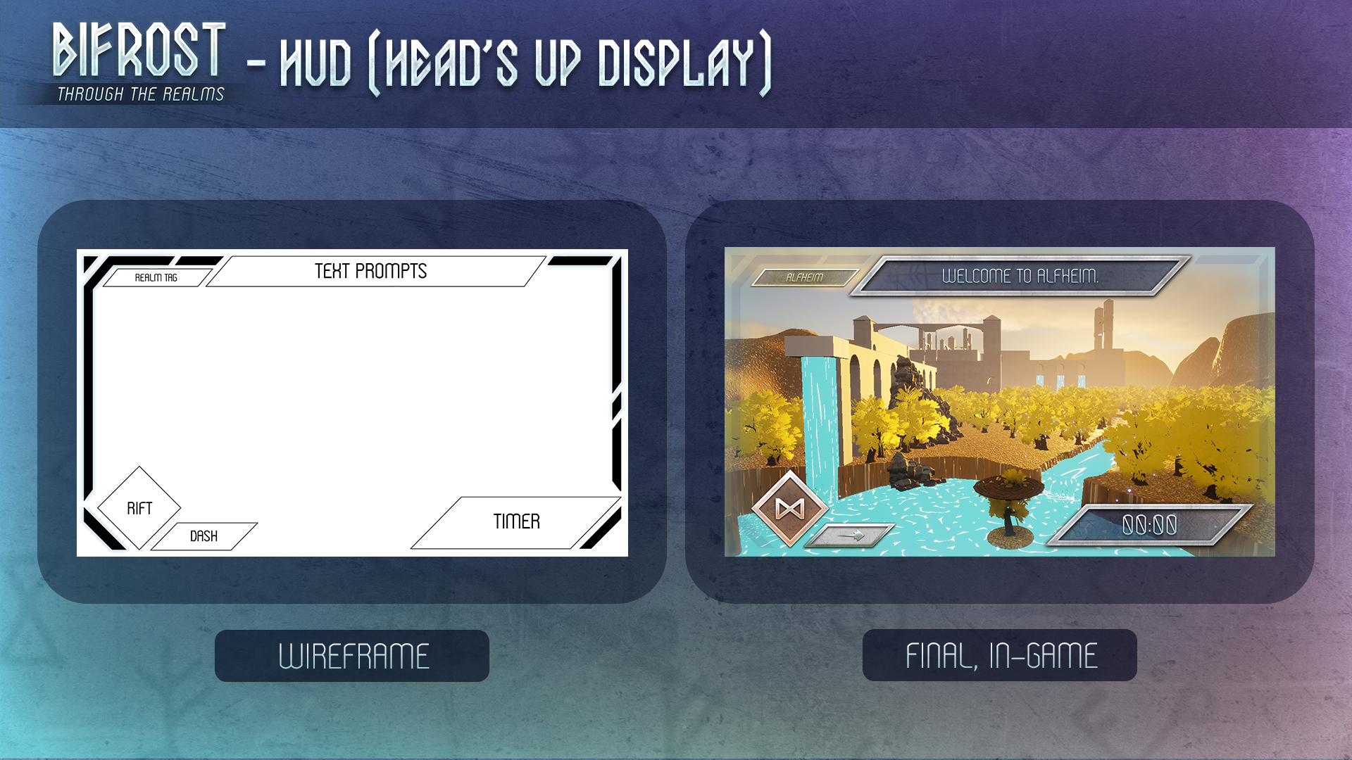
Designed, wireframed, and created HUD
Designed and created 6 ability icons
Designed and created the abilities wheel
Designed and created 6 realm tags
Designed and created 2 dash icons
Designed and created timer
Designed and created text box
Designed and created start menu
Designed and created pause menu


