Well, where do I even start?
SurviveVille has been one of my absolute favorite projects to work on, and I’m just getting started!
I’ll be the first to admit that I’m extremely quick to skip steps in my design process. I often like to jump straight into Photoshop & Illustrator instead of taking the time to sketch, discus, and reflect on my work in its early stages.
However, when I started with SurviveVille, I knew I wanted take my time, and really slow down the design process. I wanted to make sure I was intentional with every step and stage of development. This included talking to more people, engaging with more strike teams working on different aspects of the game, and doing research on games whose user interface and user experience models not only compliment the gameplay, but are rather embedded and woven into the fabric of the game itself.
Gathering Information
The first step in my process was gathering the necessary information. While this may seem like a basic, straightforward step, it was a bit more challenging than that!
SurviveVille, at its heart, is a systems heavy game. And with systems comes user interface elements and user experience models.
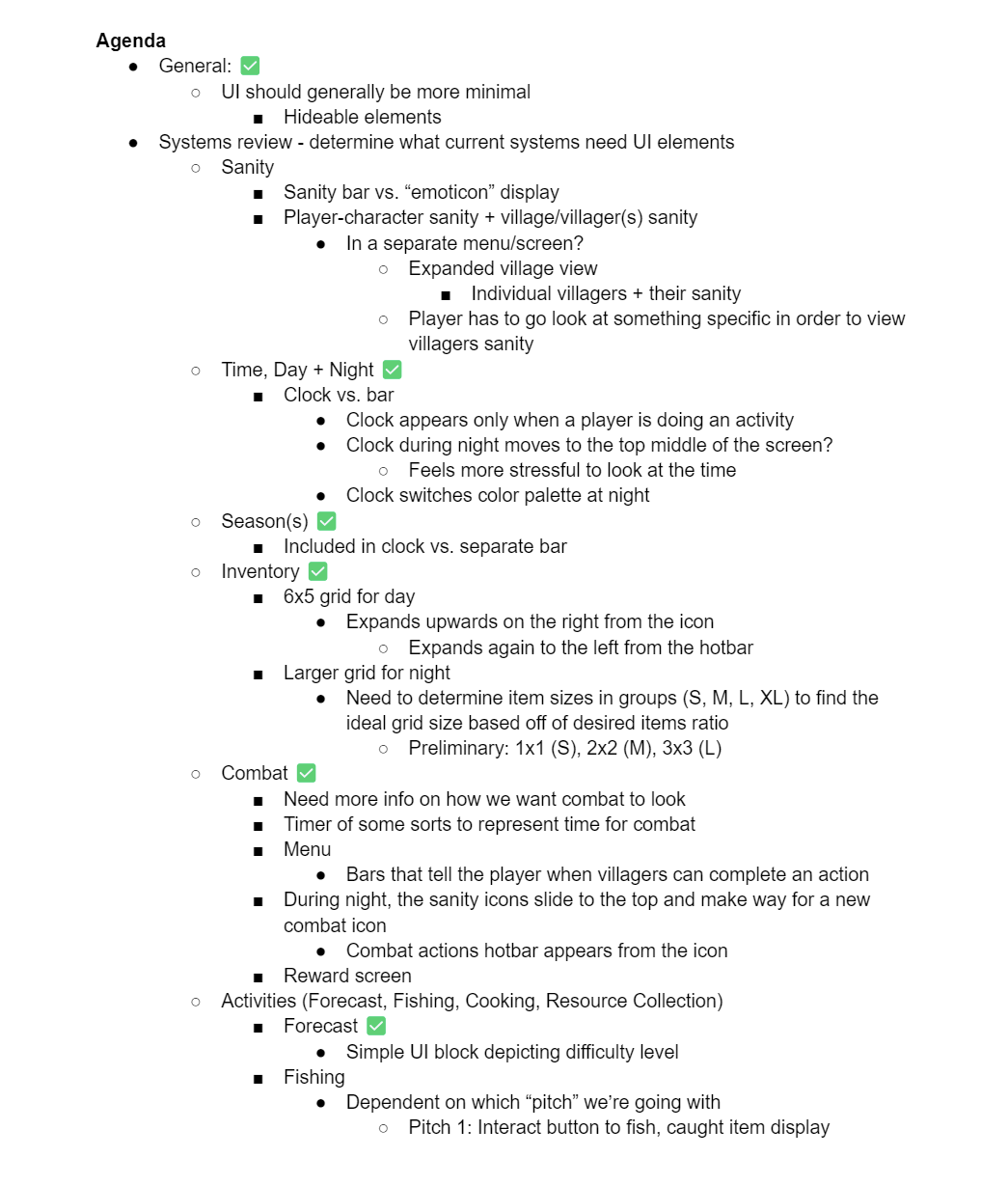
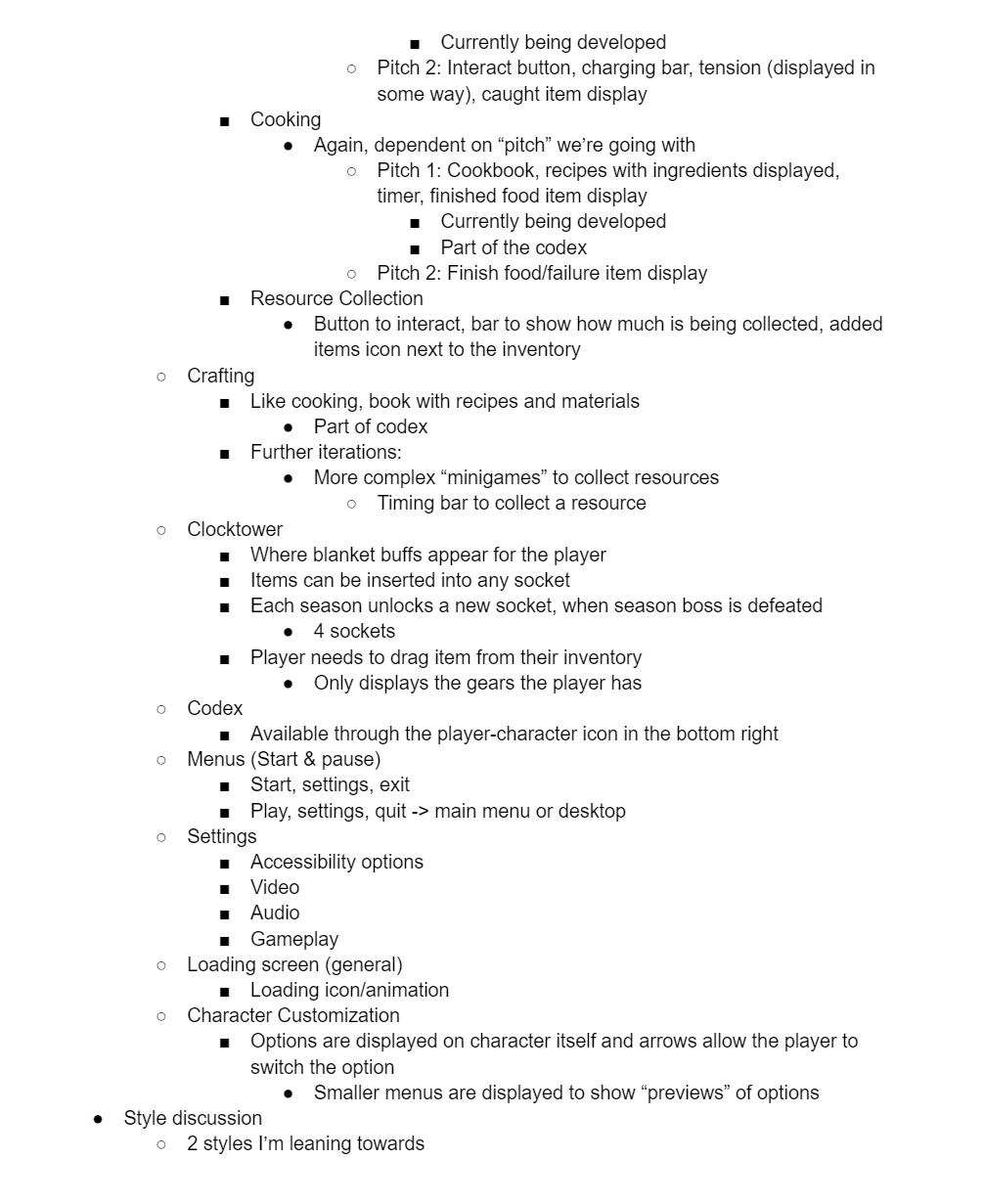
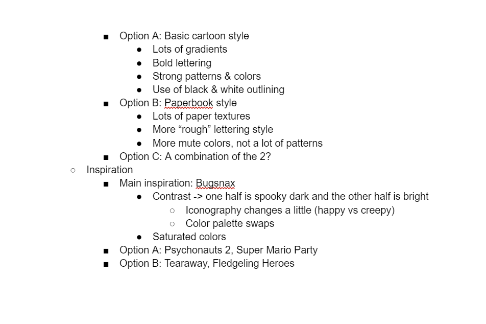
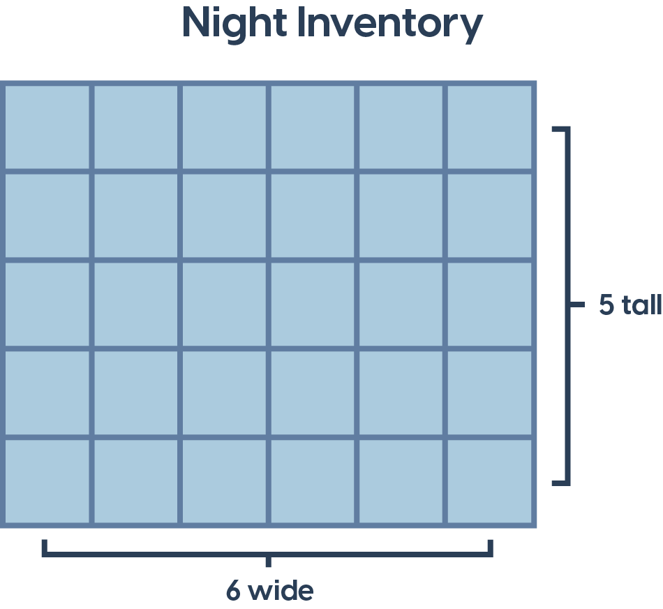
I began gathering information by meeting with the design team, and setting out exactly which systems needed UI/UX work, and what that might look like, in a broad sense. It looked something like this…
“What the heck is that?,” you might ask. Great question! That is a document that more or less shows my thinking process when I’m initially thinking about the necessary UI/UX systems in the game.
Sketches
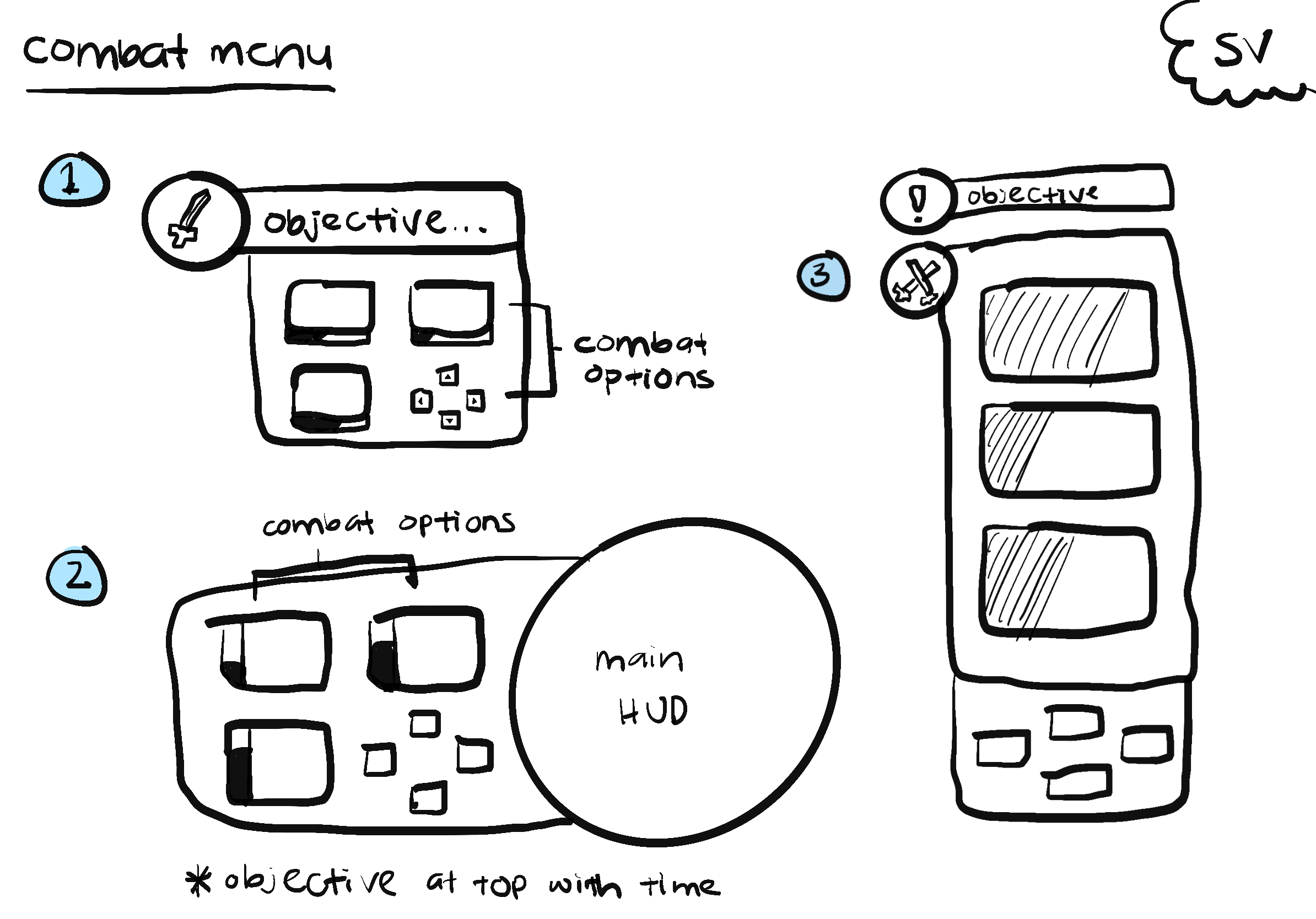
So, now that I gathered all of the necessary information in one place, it’s time for me to take this information and visualize it. This is where I start sketching - something I’ve historically been TERRIBLE at. (Trust me, ask my 11th grade art teacher!)
I start with the essential elements, the UI/UX systems that are going to largely define how the player views key information about the game and its systems. I take each essential element and make 3 sketches of potential layouts, to see how information can be organized and displayed most effectively.
Mockups & Diagrams
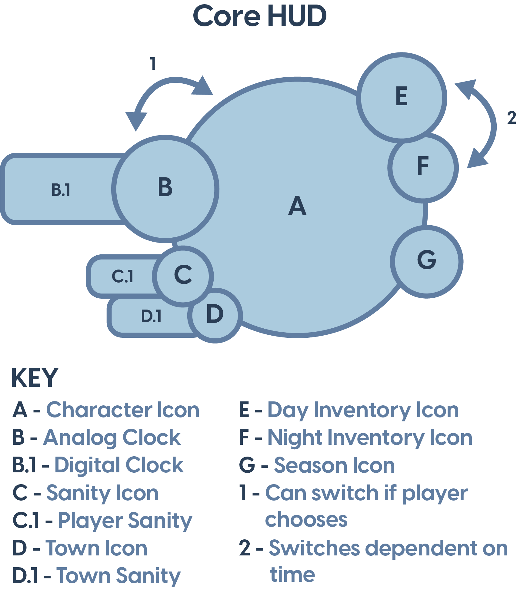
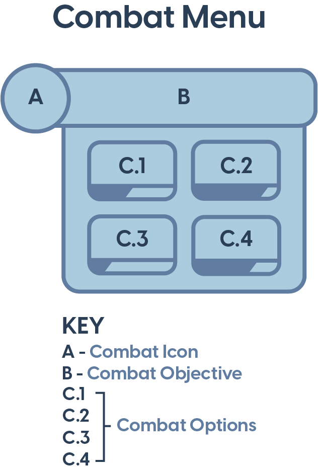
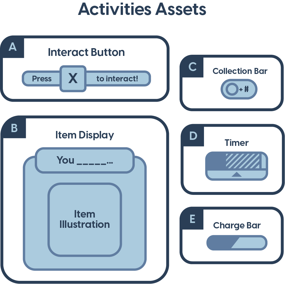
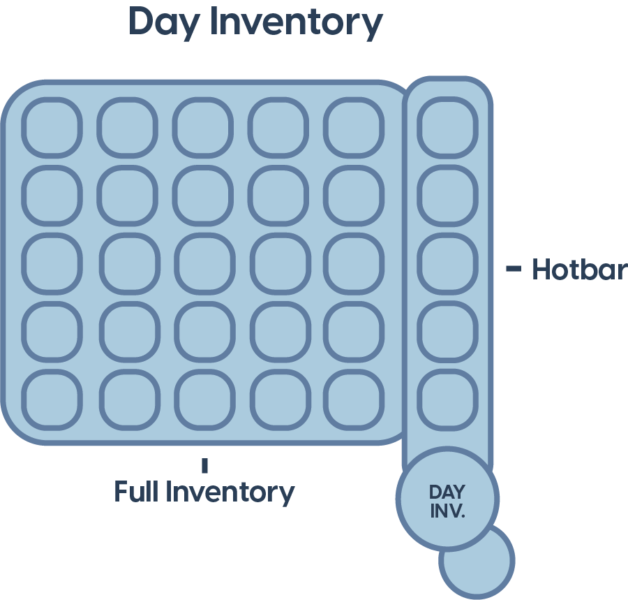
Once I finished sketching all the essential systems, I began to bring these sketches into Adobe Illustrator and work on creating functional visual representations of the user interface elements, as well as any user experience flow maps that were needed.
However, like all games, the development process is everchanging. So, whilst the next phase of development is underway and the design team is hard at work finalizing their documentation and systems, I begin to tune more into the visually aesthetic side of the UI/UX, and started to define the game’s visual identity.
Mood Board
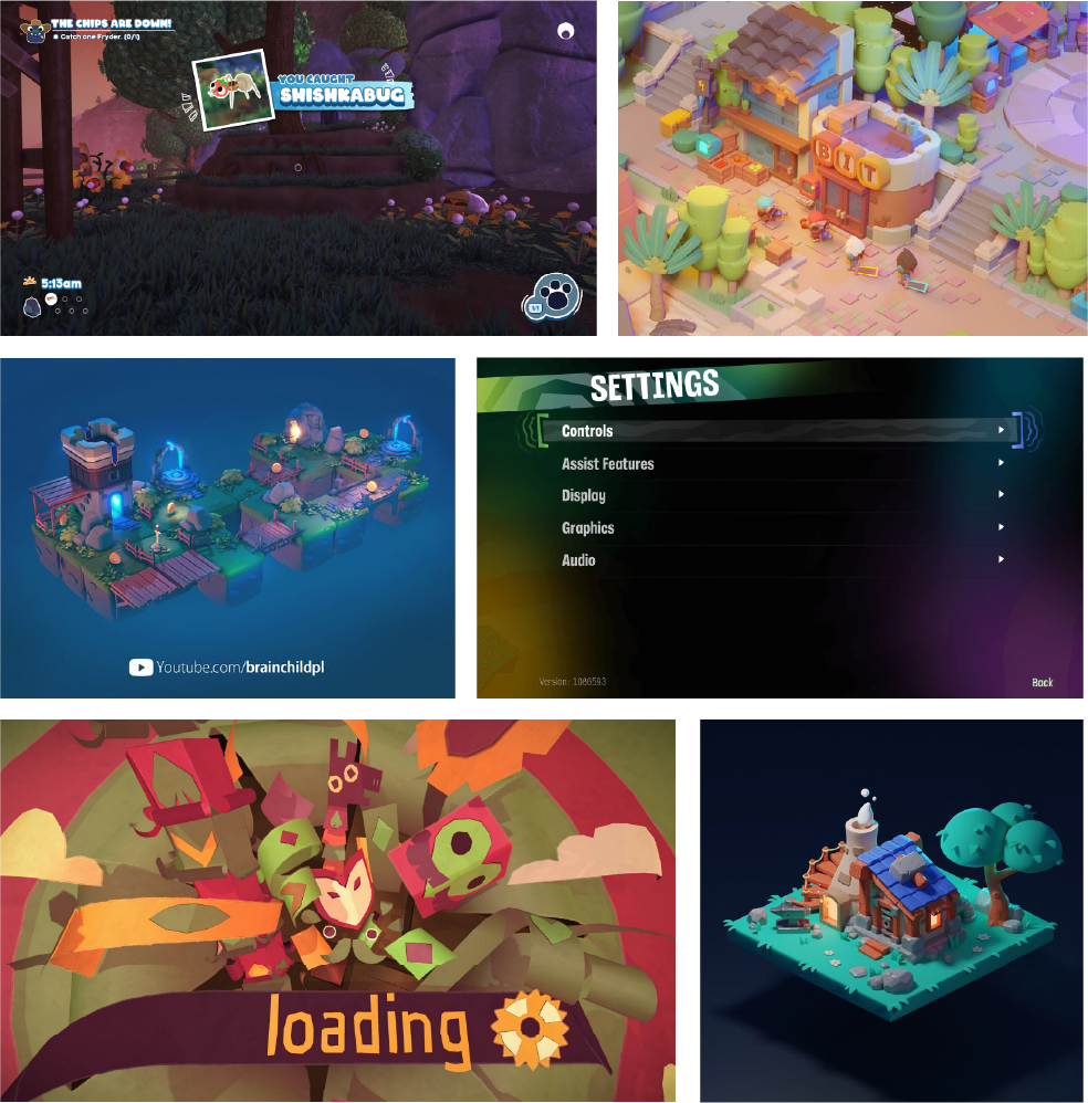
At the beginning stages of visual identity, I like to first create a mood board. This helps centralize all the visual references and aspects I want to include in the game. I researched games in similar genres, games with unique visual styles, and found other photos and images I thought were representative of our game’s aesthetic.
When creating my mood board, I wanted to include 2 main things - UI style reference from other games and 3D art style. The combination of these two things would help me get an idea of what the visual identity of the game should look like.
Game references (from left to right): Bugsnax, Psychonauts 2, Tearaway
Style Exploration
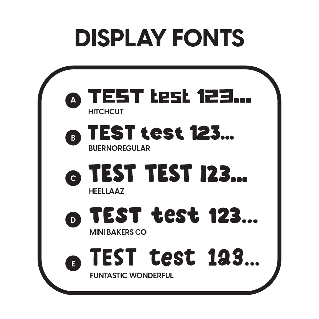
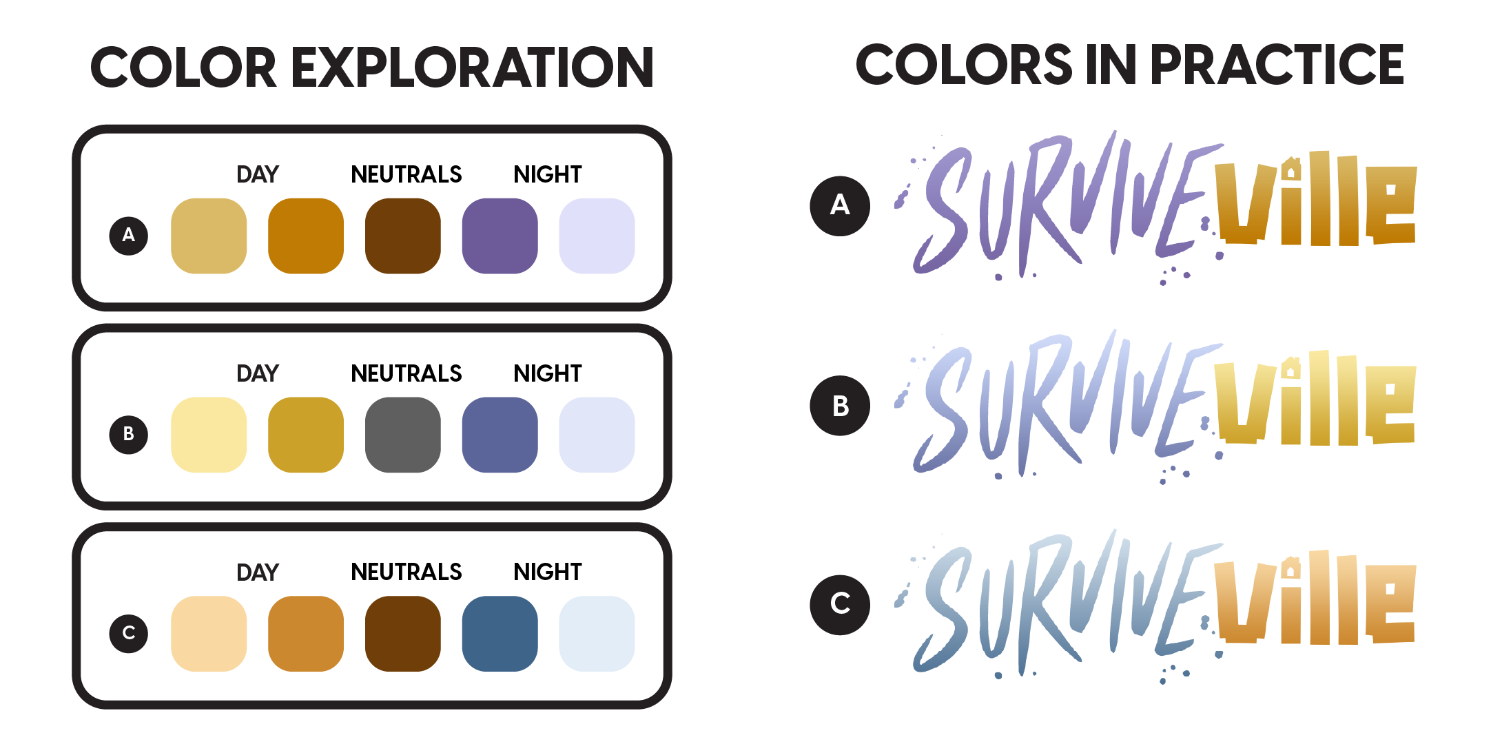
Once the mood board is created, it’s time for me to begin the style exploration. When setting a visual style, I like to first focus on 2 things, fonts and colors. To me, the fonts and colors say a lot about a game’s visual style. The font is a visual element that ties in every other element of the game, from a user interface view. The color palette of a game is what drives its visual identity, and how it conveys emotions and themes to the player. In order to find the best combination of the 2, I came up with some options and let my team vote on which option they liked best.


